
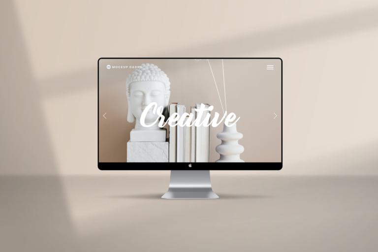
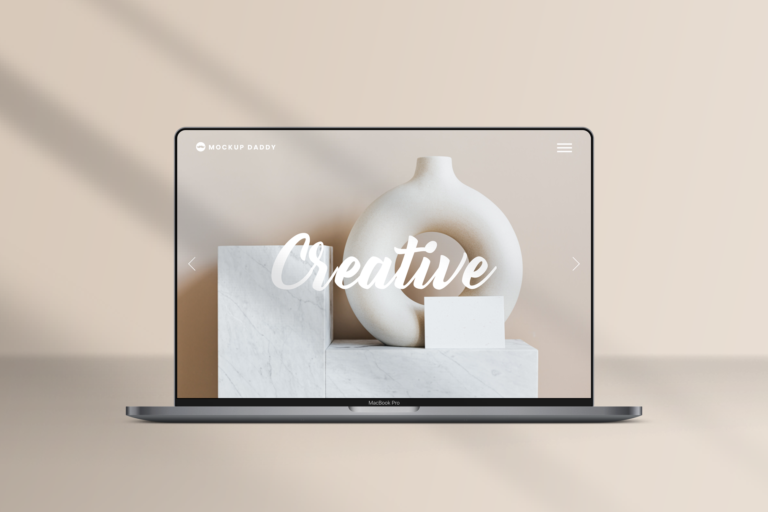


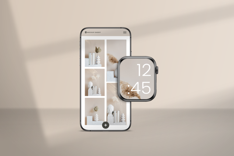
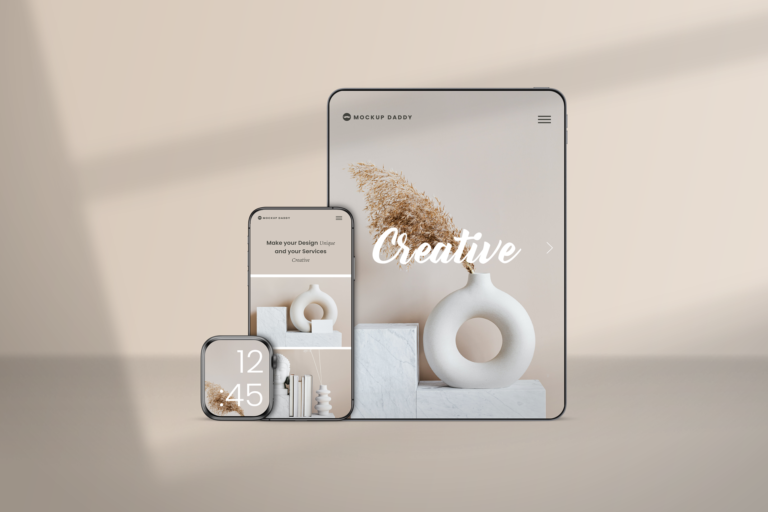


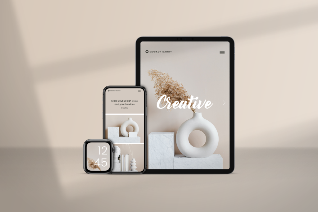
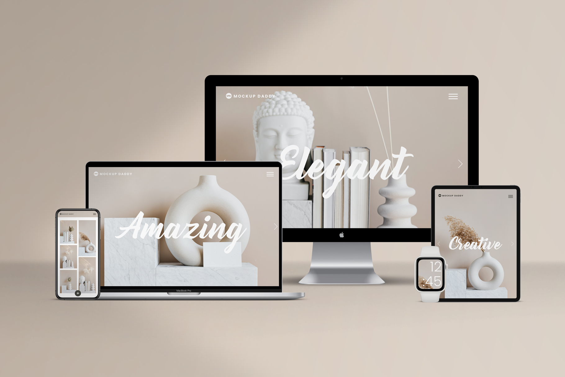
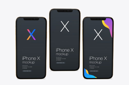
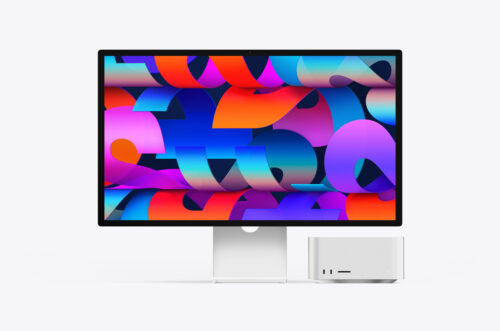
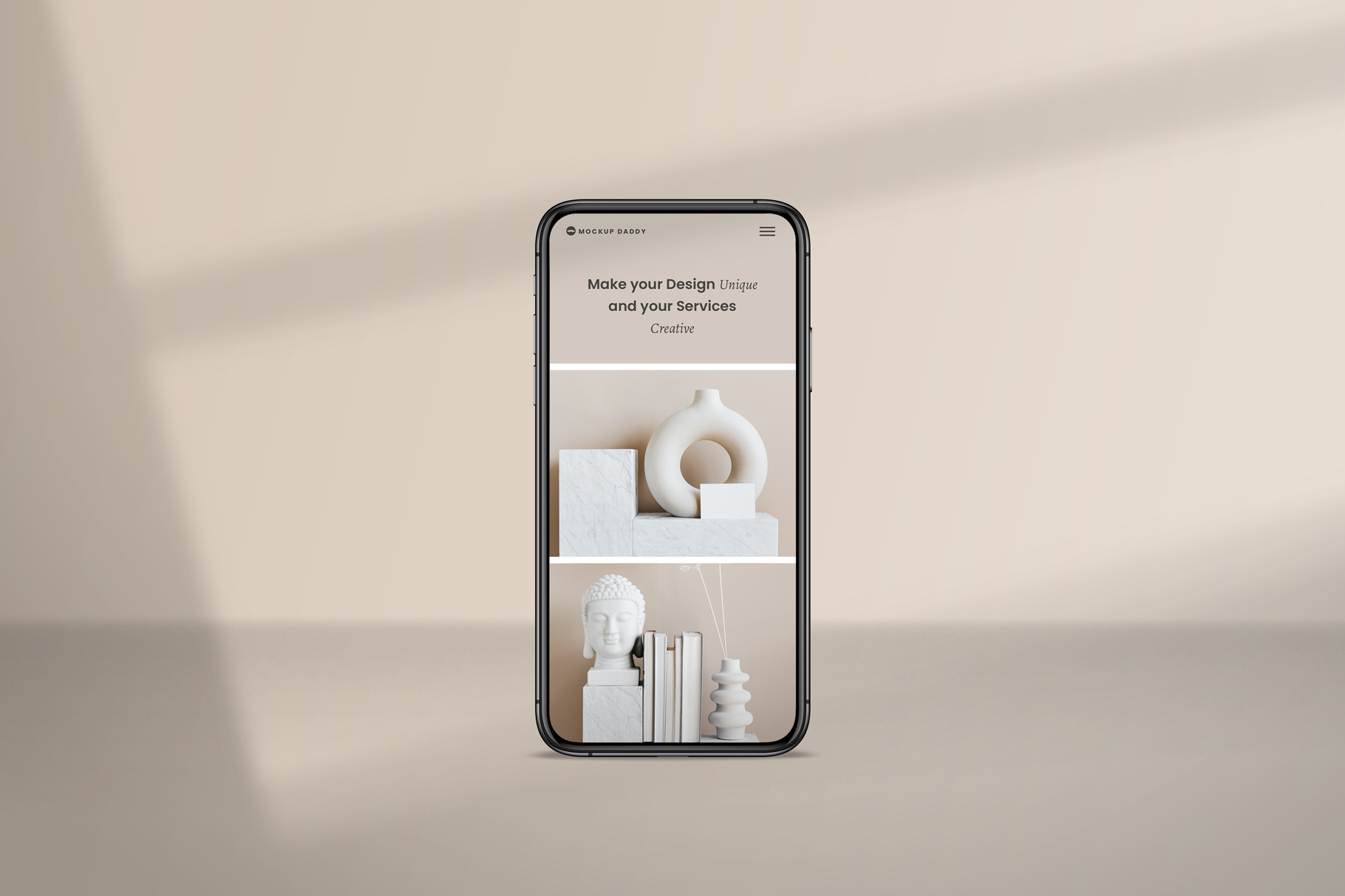
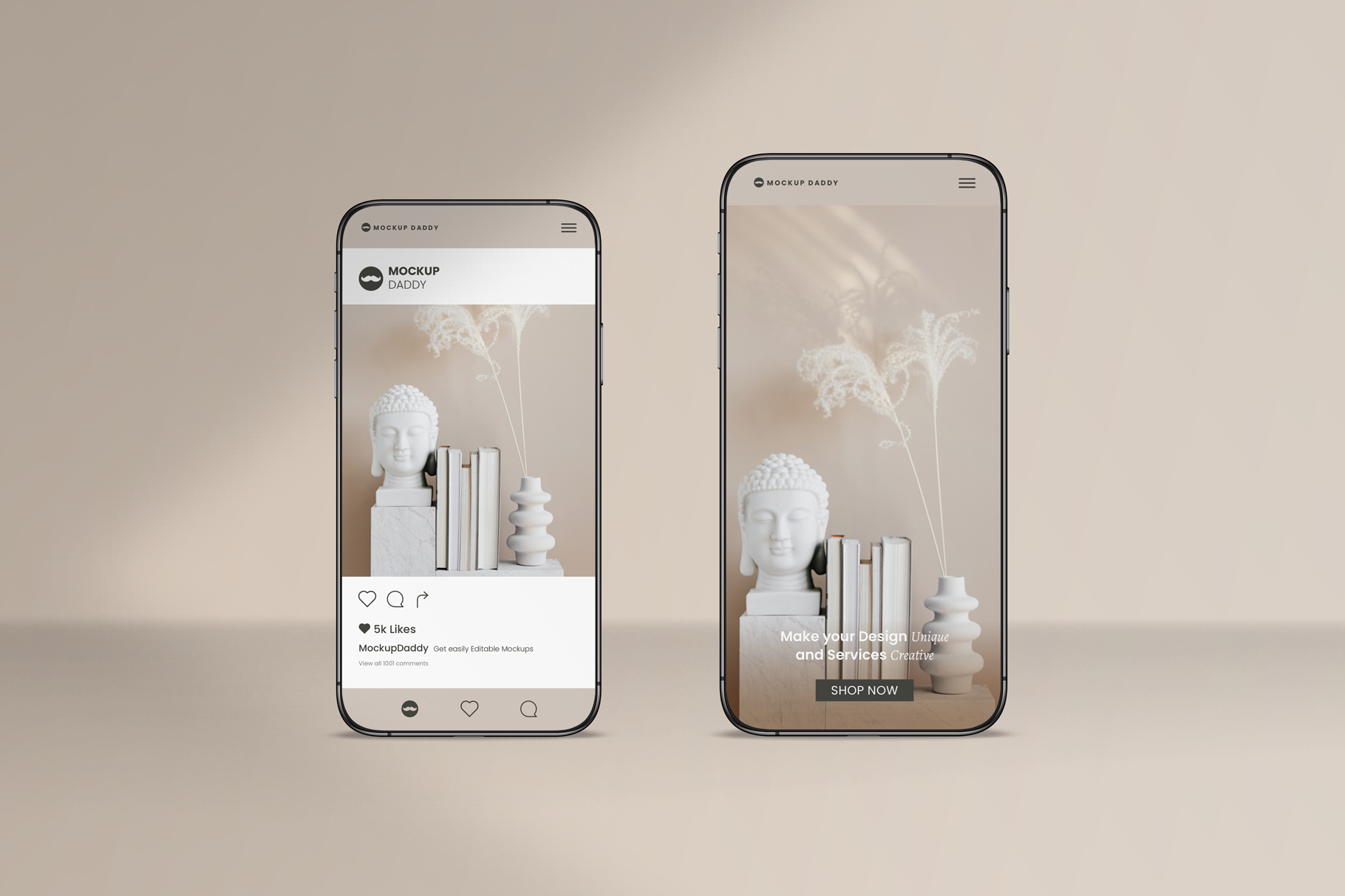
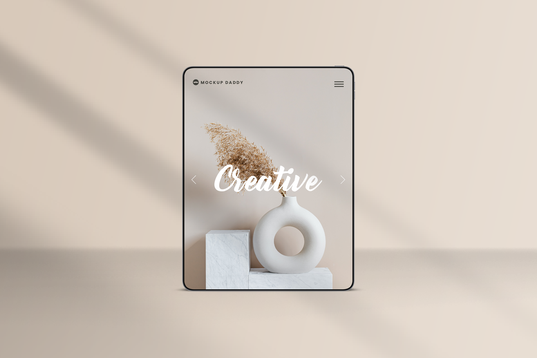
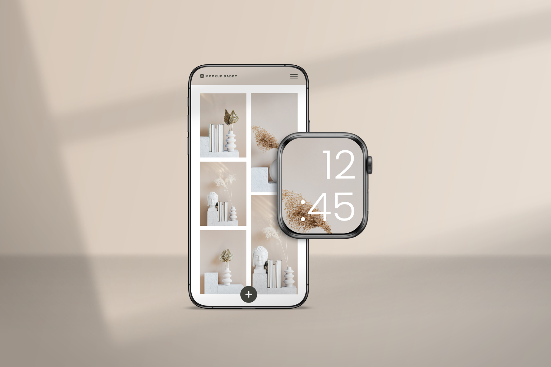
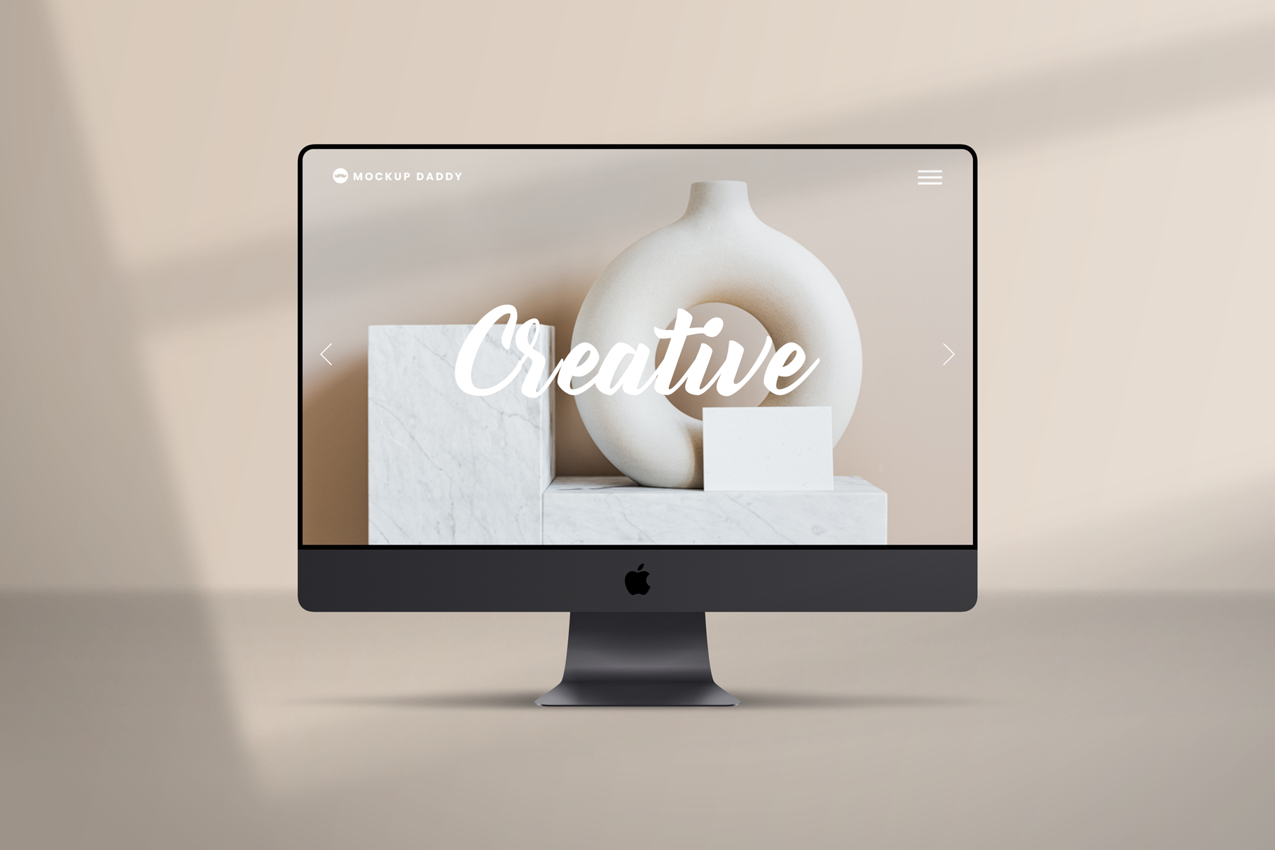
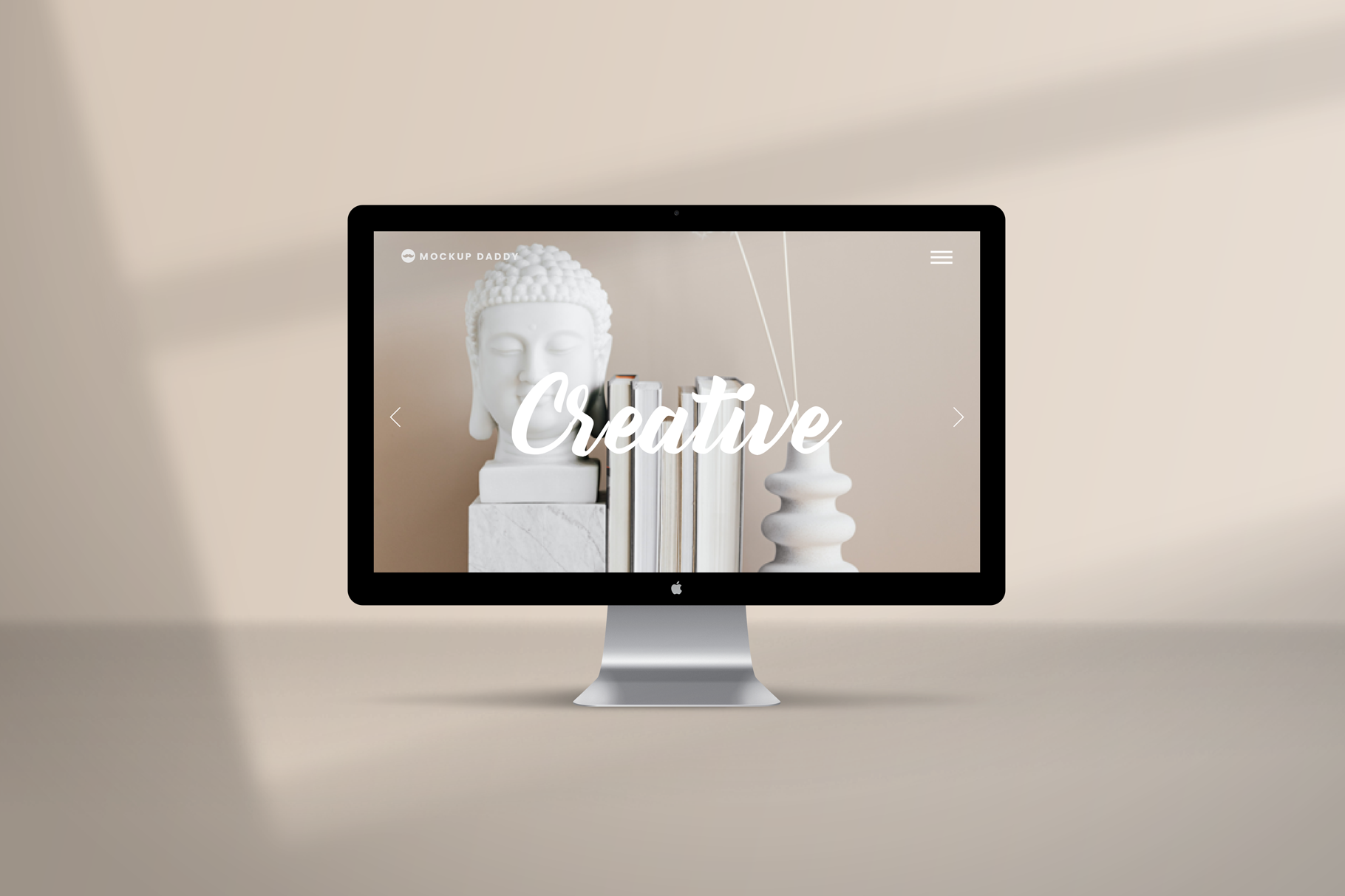
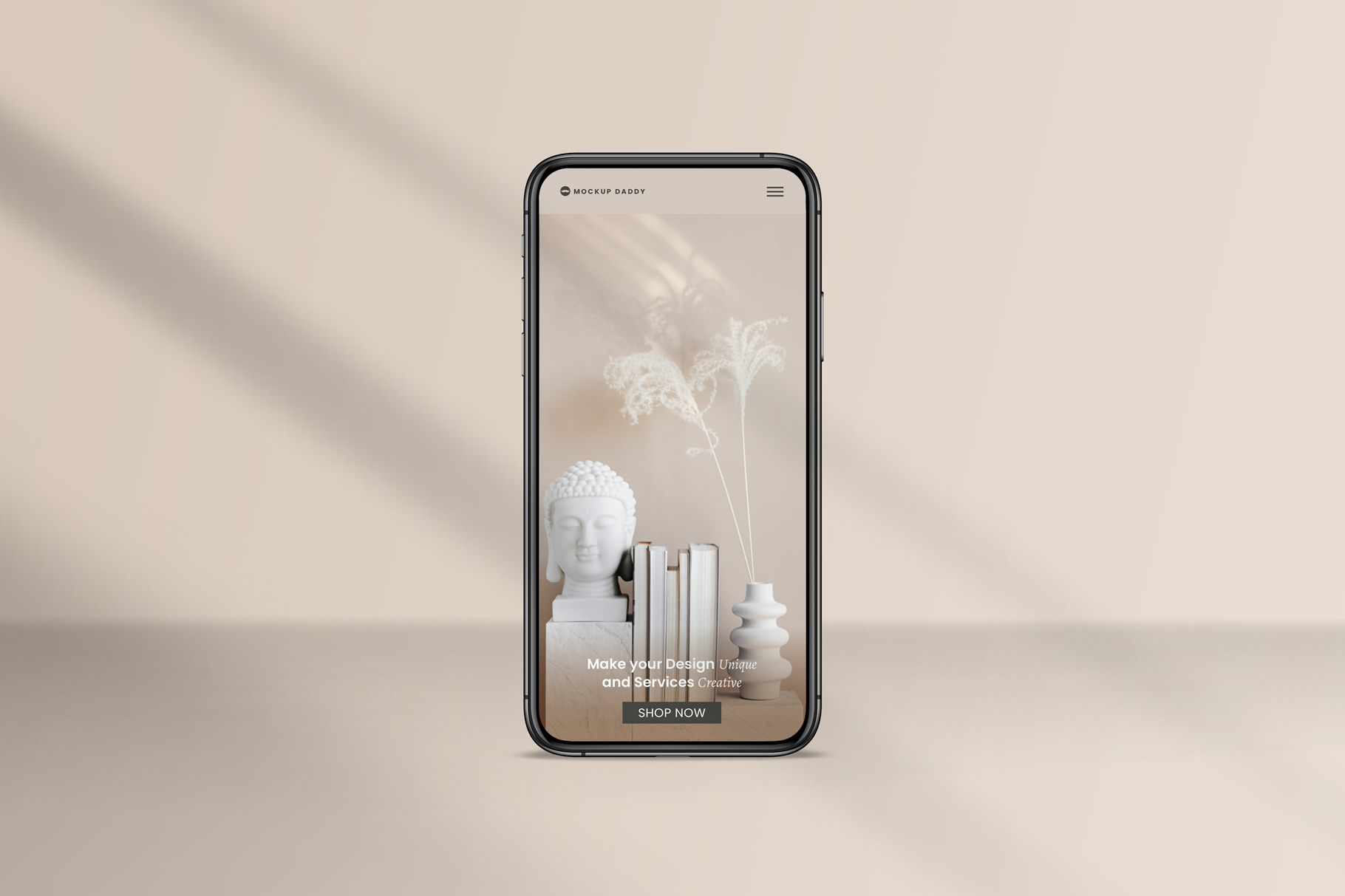
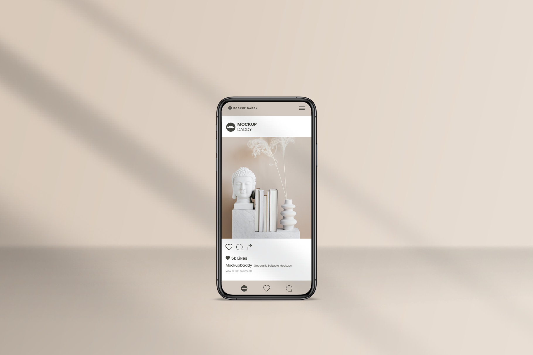
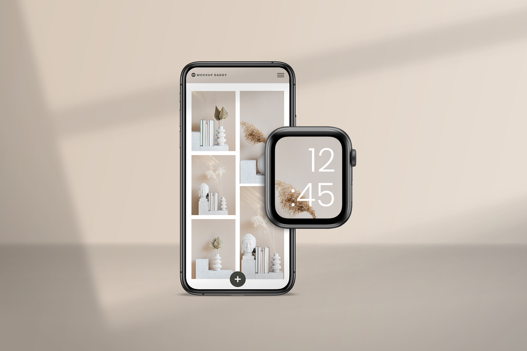
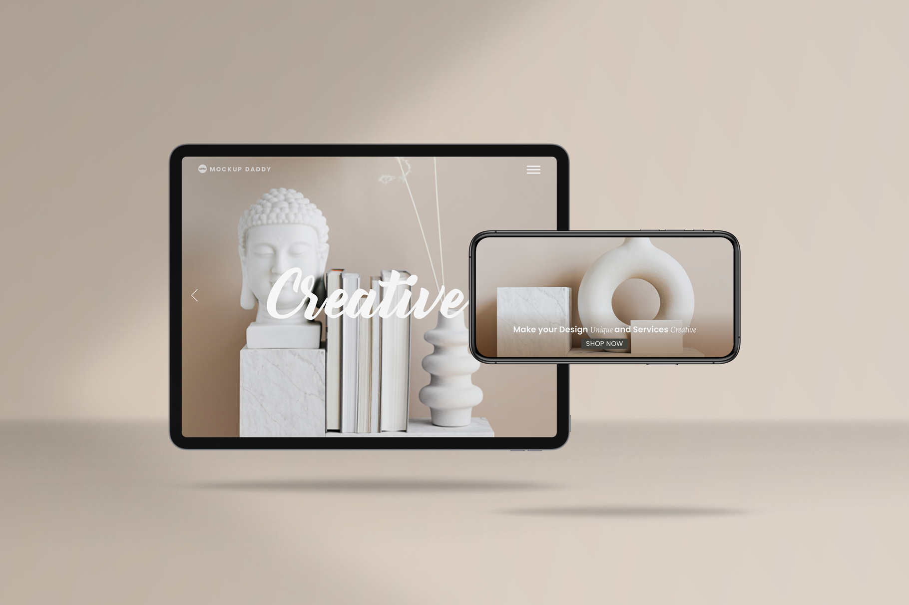
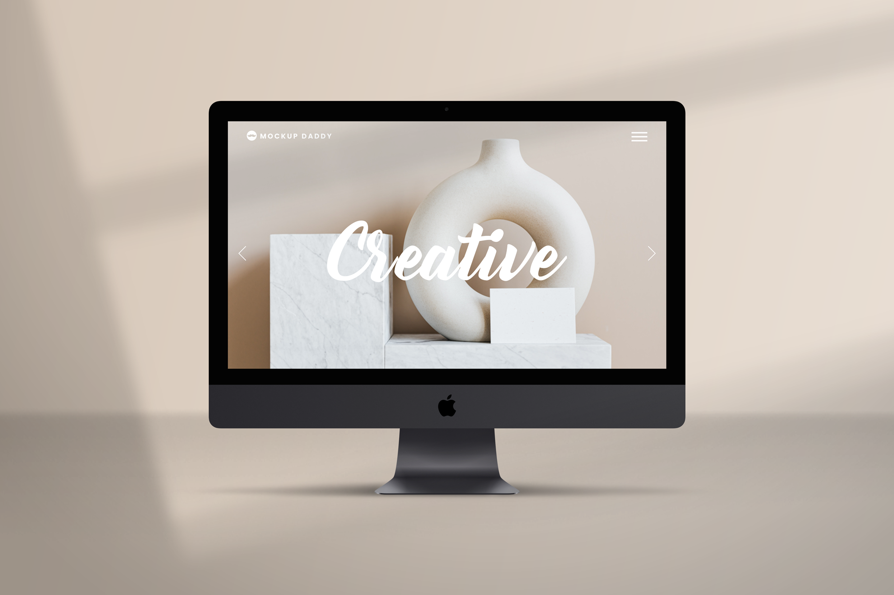
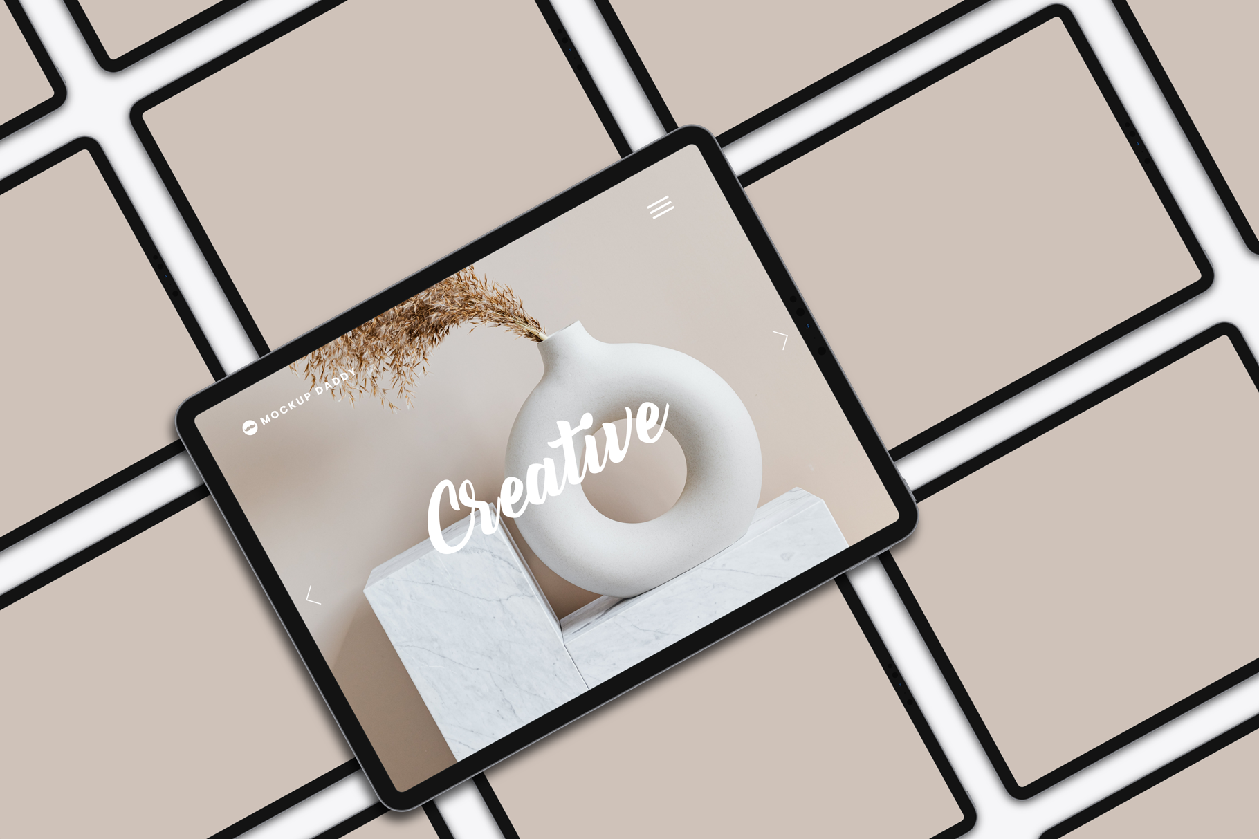
About Responsive Devices PSD Mockup:
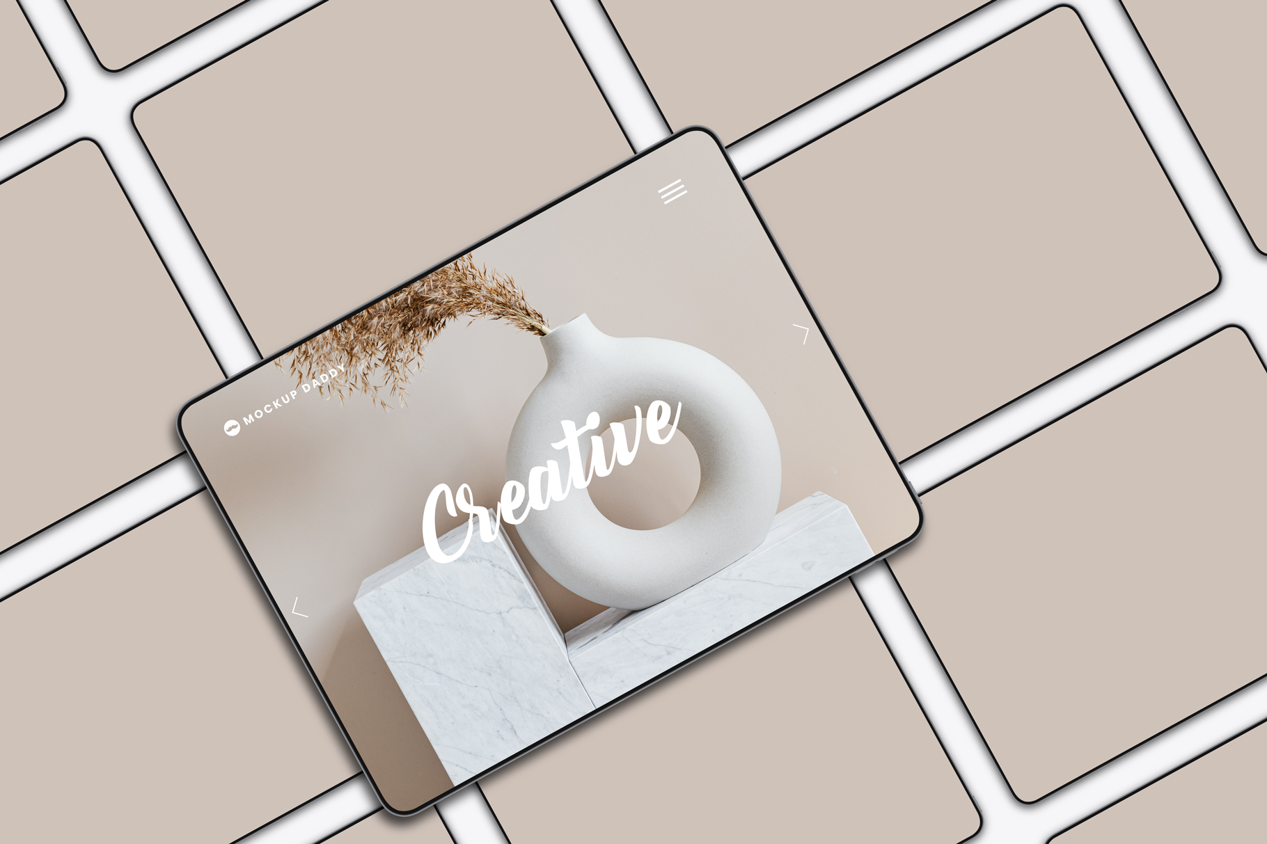
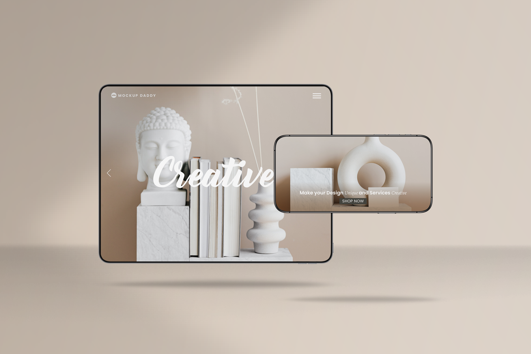
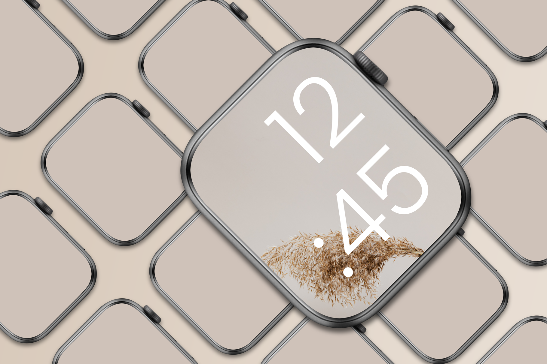
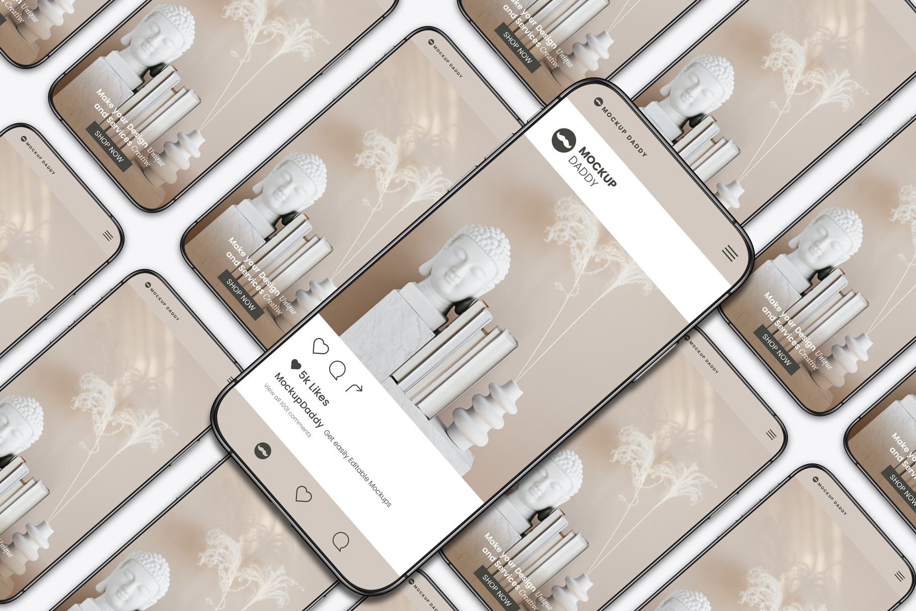
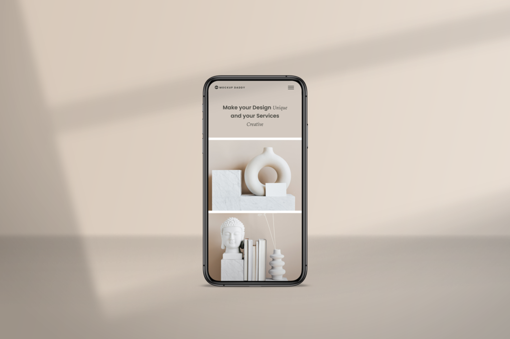
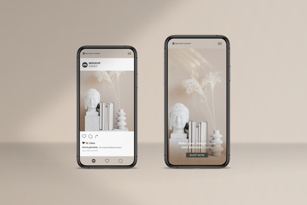
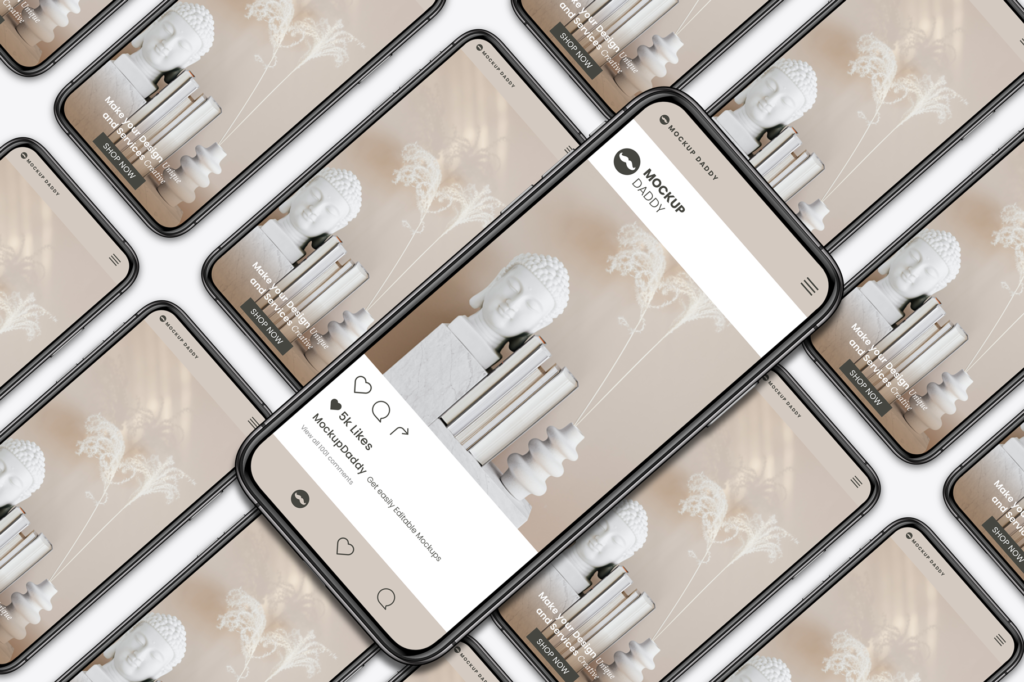
Tired of juggling multiple mockups for different devices? Our Responsive Devices PSD Mockup streamlines your workflow with a single, adaptable masterpiece! Showcase your responsive web design, app UI, or mobile game across desktops, tablets, and smartphones – all in one go!
Say goodbye to tedious resizing and hello to effortless presentations. Edit your design in Photoshop’s familiar interface, using Smart Objects for intuitive placement. Choose from multiple angles and perspectives, add shadows and reflections, and customize backgrounds for a touch of realism.
How can I alter the design within Responsive Devices Mockup?
1. Smart Object Magic: Each device screen is a Smart Object, allowing seamless editing. Simply place your design inside the Smart Object, and any changes will automatically update across all devices!
2. Layer Freedom: Dive into individual device layers to fine-tune details. Adjust shadows, reflections, and backgrounds for a realistic touch. Want a specific device angle? No problem! Choose from various pre-made angles or rotate the device layer for a custom perspective.
3. Background Bliss: Don’t limit yourself to plain backgrounds! Replace the existing background with your own image or choose from our diverse collection to match your design’s aesthetic.
4. Color Coordination: Want to match the device color to your brand? No worries! Easily edit device colors to create a cohesive presentation.
5. Go Beyond the Mockup: Our PSD files offer flexibility! Export individual device layers for further customization in other design software.
Stuck on editing? Don’t sweat it! Our 24/7 support team is here to guide you through every step, ensuring your designs shine on any screen.
